2019 Pantone Color of the Year
Updated 9/20/22

Each year, Pantone unveils its color of the year. For designers and design aficionados, this is a big deal. Color is never just a color, after all. It’s a mood. It’s a message. The colors we choose—whether for our clothes or our furniture—reveal something about who we are and how we think. In choosing a color of the year, Pantone is setting a mood and predicting a little about the year to come.
The Pantone color wheel contains nearly 2,000 colors. The selection for the 2019 Pantone Color of the Year relied on research about brand marketing and product development, both of which tap into what consumers choose and what they react to most strongly. The chosen color of the year allows all of us to get a window into that research, to learn what color best represents who we are, collectively, right now.
We offer advice on how to use the 2019 Pantone Color of the Year in your home. What colors will be decorating homes this spring?
Trending Color Palettes
Even more interesting than looking at past years’ trendy colors one by one, though, is seeing them grouped together over decades: for example, the vivid colors of the 80s (which included Ribbon Red and Radiant Orchid) softened into a more neutral 90s (with its Overcast and Lead Gray).
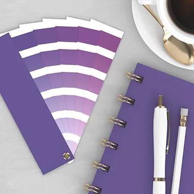
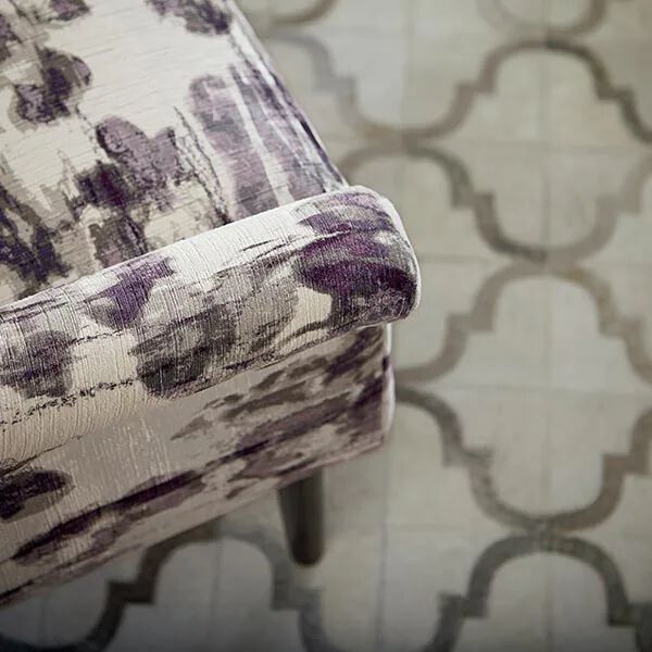
In 2018, Pantone’s color of the year was Ultra-Violet. Bright and dramatic, Ultra-Violet made a bold statement for 2018. Pantone said that the color was “complex and contemplative,” and “suggests the mysteries of the cosmos.”
Spring 2019 Color Trends
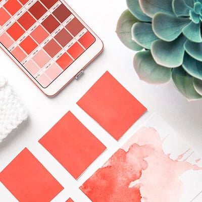
The 2019 Pantone Color of the Year was recently announced: Living Coral. Pantone earlier revealed a hint: the 2019 New York Fashion Week Color Palette. These are the colors that will strut down runways this spring, appear in store windows, and likely, start decorating our homes as well.
The forecast maintains the boldness that began with last year’s Ultra-Violet. This year, Pantone describes its colors as, “Vibrant without being overpowering … illustrate our desire for authenticity and our continued need for creativity and relatable, accessible design.” And we say, cheers to that! The palette begins with Fiesta (a bold orange-red), Jester Red (a deep, elegant red), and Turmeric (a bright orange). It shows that design in 2019 isn’t afraid of taking chances. Go bold or go home. Or in our case, perhaps it’s more like, “Go bold in your home.”
Embrace Color Trends in Your Home
Bassett Furniture makes it easy to embrace the colors you love in your home décor, whether you want a sofa in a bold, trendy color or if you want to accent your neutrals with new, vibrant accessories. We offer nearly endless selections for our fabrics and leathers (over 800!), so you can make sure that your colors represent you. Whether your favorite colors are this year’s hot trend or a perennial favorite, we want to make sure that your home surrounds you in your favorite hues.
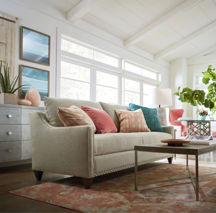
But you don’t have to commit to an entire piece of furniture in Living Coral. A safer approach is to purchase furniture pieces in timeless colors while accessorizing with accent pillows and art in this year’s hot colors. That way, you can keep your room on-trend and keep your budget in check.
If you want help incorporating Pantone's 2019 Color of the Year into your décor, we’d love to offer ours. Schedule an appointment with our design experts for a free consultation.
Thank you for enjoying our archived content. We invite you to join us for the most up-to-date and trend-right insight into the design industry and our Bassett products.
